Mediserve
Mediserve stands out in the field of innovative healthcare training, pioneering the use of cutting-edge tools to provide advanced, hands-on courses. Their training philosophy integrates interactive online paths with application software, offering participants not only theoretical knowledge but also hands-on practice, thus ensuring engaging and effective learning.

The challenge
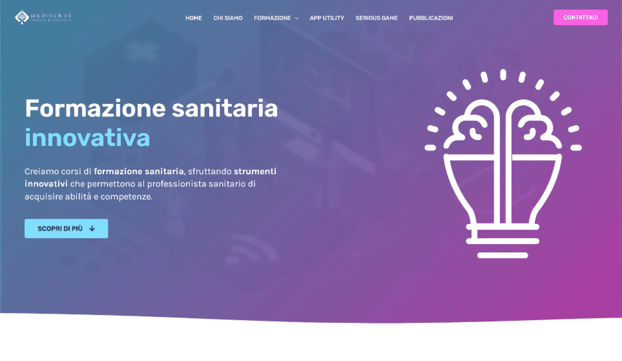
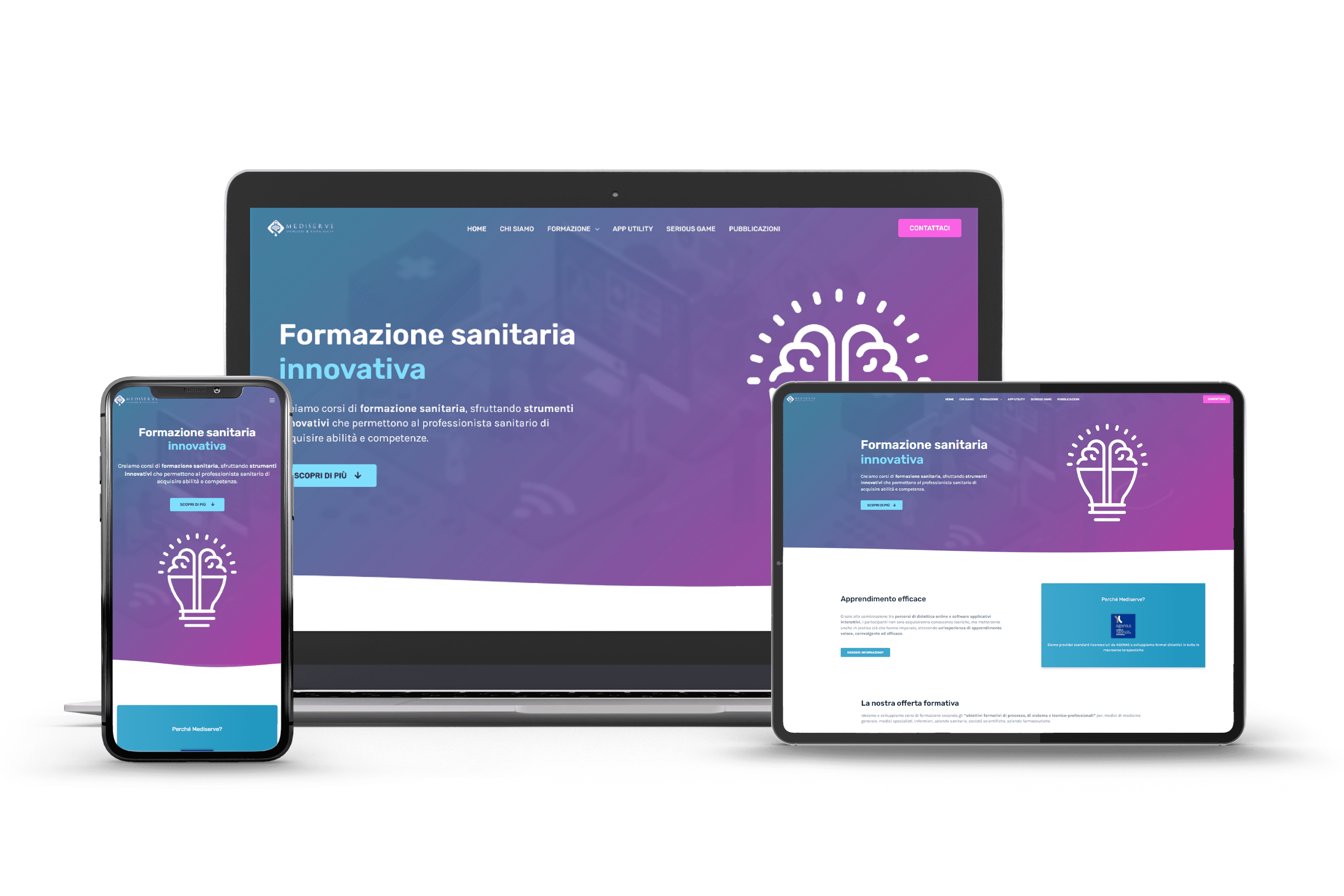
What sets Mediserve apart is their adoption of an innovative digital training approach, so we tried to envision a new design for their sitoweb that would convey the image of a cutting-edge, up-to-date company.
However, the project required not only a new visual approach, but the structuring of clear, direct communication in line with the company’s principles, as well as a reorganization of the content to encourage practical and intuitive navigation.

Graphics & Design
On the design front, the new Mediserve product is distinguished from its predecessor by a color palette that is intended to capture the user’s attention and distinguish the company from the mass of practitioners in the field of medical and scientific education and research. The layout and animations included on each page make for a dynamic browsing experience (recalling the principle of practice and interaction adopted by Mediserve in the development of its educational content), while the readable font assisted by supportive graphical elements facilitates understanding of the content.
On the technical front, the site’s structure is supported by a system of custom post types that allow the company to conveniently and immediately update the site’s content in total autonomy, then offering users the ability to navigate through the training offerings and view, in just a few clicks, all the information associated with them.


