Il Bullone
The nonprofit foundation Il Bullone challenges conventional perspectives every day to create a more inclusive, responsible and sustainable future. Il Bullone is able to accomplish all this with the help of users who donate freely to its cause or subscribe to the official monthly Il Bullone magazine, in which ordinary people and public figures recount the obstacles and contradictions of our world, accompanying readers on a journey whose destination is always illuminated by a glimmer of hope in tomorrow.

The challenge
The project to migrate and redesign Il Bullone website required us to take a careful approach to the needs of managing the database of articles and multimedia content accumulated by the foundation over its long years of operation, as well as the need to create a new, dynamic and flexible structure that would allow users to navigate quickly and smoothly.
At the same time, we had to search for an effective solution for implementing a donation system that would give users the opportunity to subscribe to the official Il Bullone magazine or make free donations in direct support of the foundation’s activities.
A key point of the brand’s repurposing, finally, was the reformulation in the use of the foundation’s official palette and the application of illustrations, icons and other graphic elements that could both harmonize with Il Bullone’s already established identity and show it in a more modern and up-to-date key.

Graphics & Design
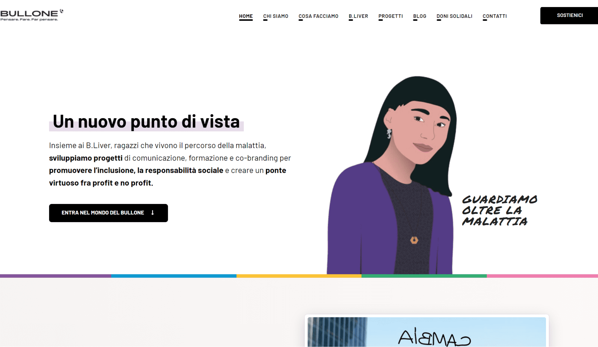
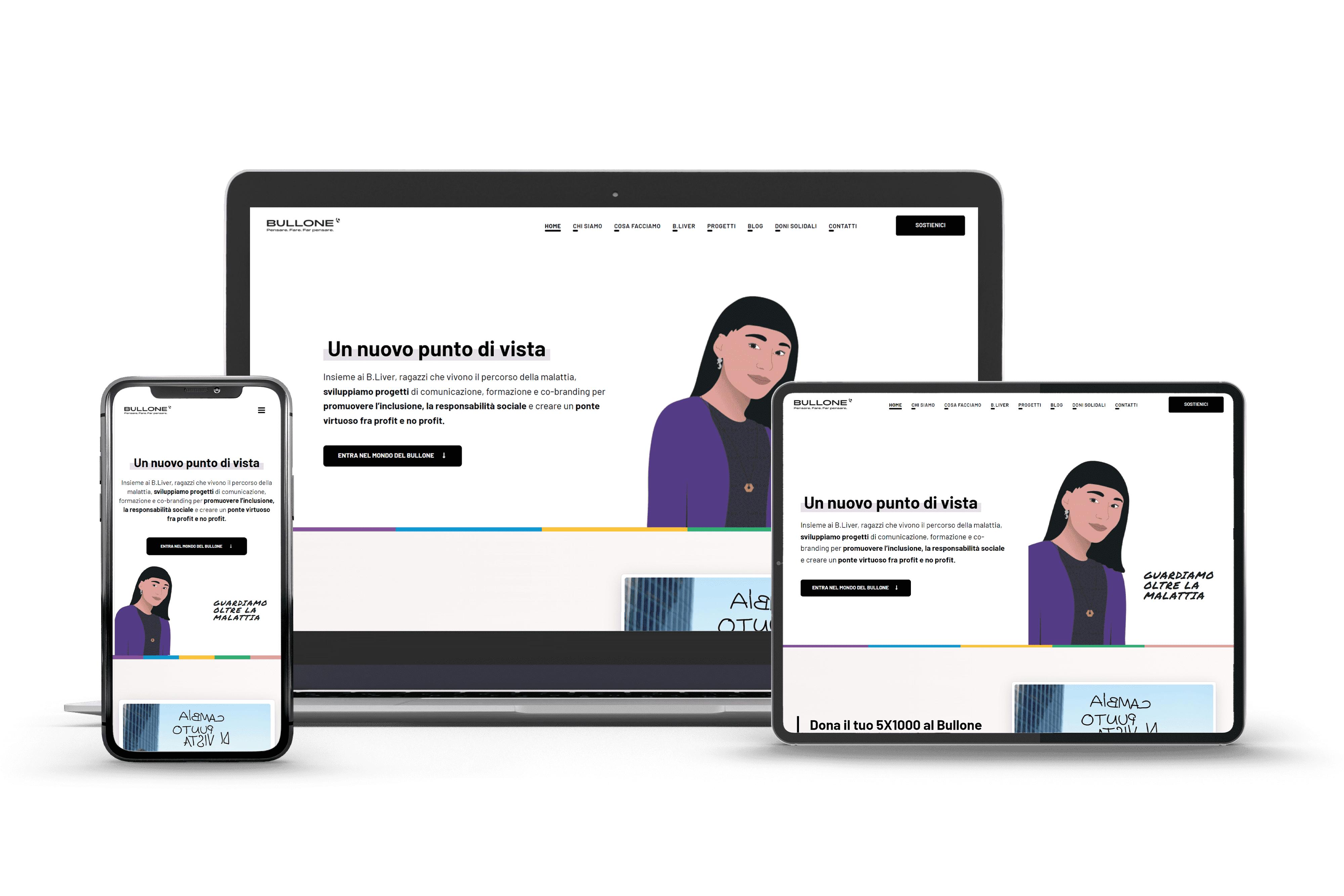
Our proposal for the new Il Bullone site began with a reworking of its structure, providing adequate space for the different operational areas in which the Foundation is engaged and breaking them down into a clean and intuitive navigation menu. Therefore, we have included a “Blog” section, previously absent, dedicated exclusively to the articles that are published daily by the editorial staff of Il Bullone, creating an article display template that can accommodate reading on all devices without sacrificing the presentation of secondary information useful for the user to explore the other functions of the site.
On the graphics front, our work drew heavily from the brand guidelines to package a site rich in color and high-quality media that guide the user through the navigation, giving each page and section a personalized look and feel based on the theme or topic they cover.
On the other hand, in terms of the portal’s most important features, we have included applications that can enable users to access Il Bullone’s monthly subscription and free donation features easily, immediately, and securely.


