Accomodo
Accomodo is an online platform that focuses on facilitating the search and booking of short- and long-term accommodation. Its main activity is in the rental sector, connecting owners of properties available for rent with potential tenants.
Through the Accomodo website, users can explore the files of each accommodation and easily get in touch with owners to arrange executable payments directly on the platform.
Project Goals
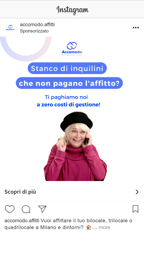
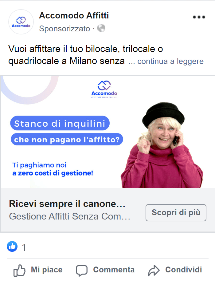
For Accomodo, our creative and marketing teams started from scratch in creating a solid brand identity that could communicate the Brand effectively.
Fundamental, for a brand engaged in property rental management throughout the country, were first and foremost the choice of a color palette capable of conveying professionalism and safety, but also welcoming and inclusive. Similarly, we decided to orient the Brand’s communication toward open and friendly tones, accessible to all groups of possible users interested in the service but without sacrificing the seriousness that should distinguish a rental agency.
Creativity & Strategy
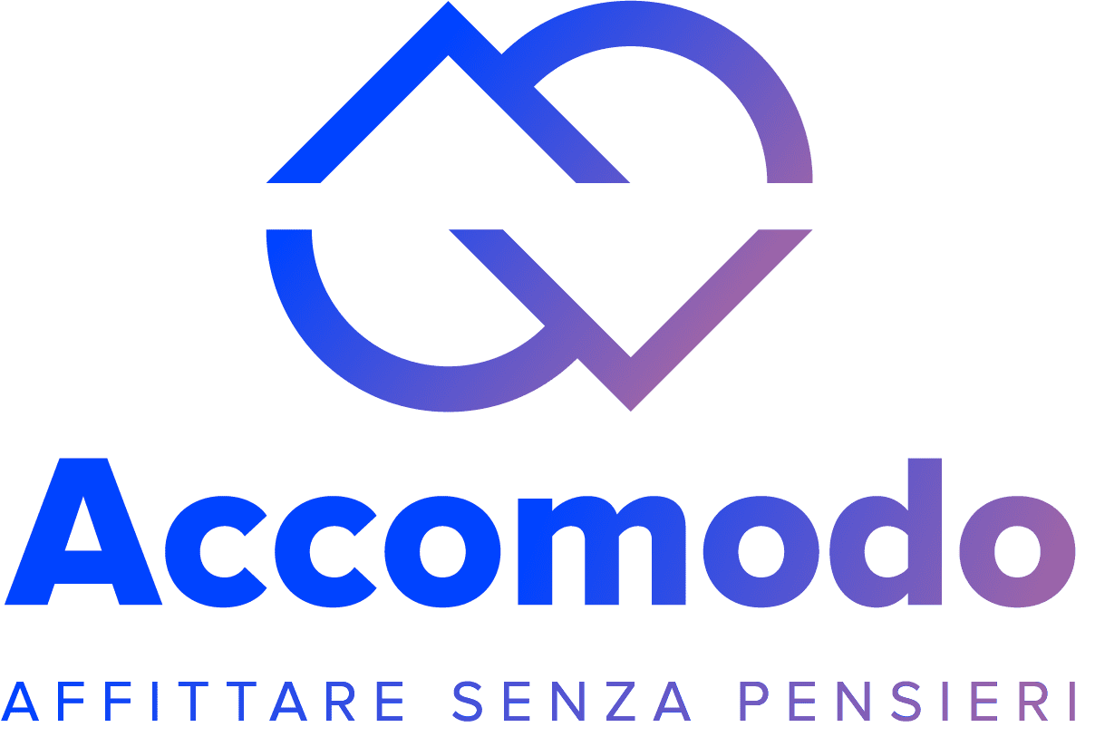
Accomodo’s Brand Identity that emerged from our work is shown to users through a logo that recalls the iconic “pin” image used in displacement apps revisited to suggest to the viewer the combination of the brand’s first letters, “A” and “C.”
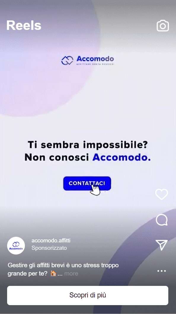
The color palette veers toward the blue/purple spectrum, elegant and professional colors whose seriousness, however, is muted by more neutral hues that are repeated in marketing campaign creative and the website to suggest feelings of warmth and welcome to users.

